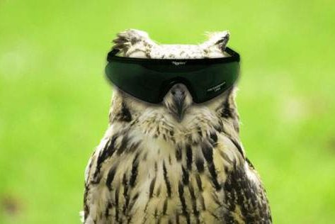
The Rice Owls are hopping on the brand refresh bandwagon, as they will unveil their new logo tomorrow on Conference USA TV at 1pm on 4/11. And as the Owls try and get with the times as far as branding, now is as good a time as ever to look back at some of their logos throughout the years.
First we have the I meant to take a gummy vitamin, but I actually took some of mommy’s pills logo used from 1941 – 1949. That will teach mommy to keep her pills hidden in a better spot.
Next we have the Nerd Alert! logo used from 1950 – 1961. Clearly this owl is trying to look tough in his new sweater that he got for Christmas, when in reality he’s just terrified that he’s going to get his book fair money stolen from him yet again.
This one that was used from 1997 – 2009 is much improved. Sort of looks like Nerd Owl was tired of getting stuffed in a locker and went and did steroids built muscle naturally over the summer.
And who can forget the current Rice logo? Because nothing strikes fear in the hearts of opponents more than the letter “R”.
Whatever they choose, it will more than likely be an upgrade over past logos. Although, truth be told, we hope they go retro and kick it old school with this guy:


